
Photo: avpjack, Flickr Creative Commons
Update: After I posted this, I found out that one of the panelists on Slate's "Shut Up and Listen" podcast made the same point I did here at around the 23 minute mark of today's podcast. Basically, it was said that teams like Oregon and Boise State were built with this edgy design and it seems a little sad when a team like Georgia tries it.
But really, the greatness of college football is being able to hate without really hating. This faux vitriol really just makes being a fan more fun. If you're a Georgia fan, I will happily trash your team to your face and then fully enjoy defending Georgia Tech while you trash mine. It's the one area of life when you can embrace your inner tribesman without risking genocide.
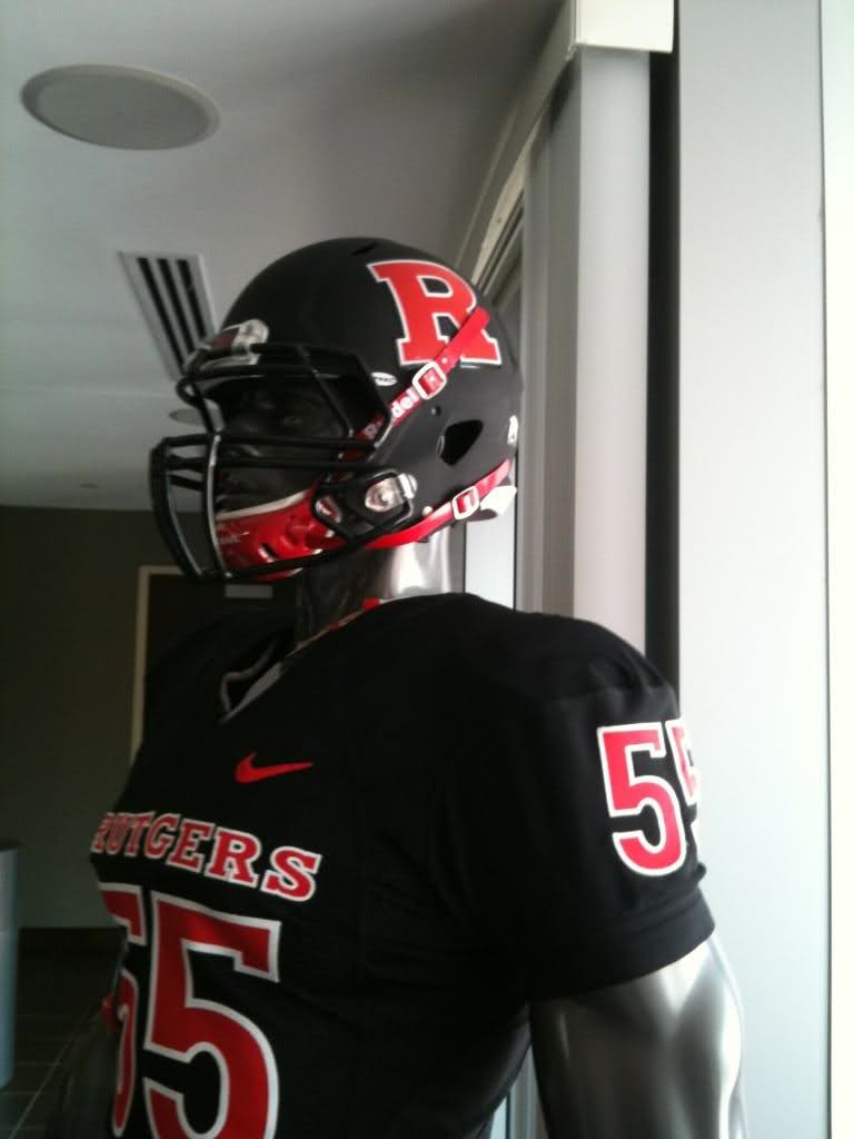
I hated the UGA uniforms because they're ugly. I have to admit that despite my spite for the Dawgs, their regular uniforms are classics nearly on par with teams like Alabama and Penn State. I actually think Penn State is a little dull, but it would be a shame for them to suddenly start taking part in the trashy-flashy fad in uniform design that Oregon started a while back. For teams like Oregon, it makes sense. Their colors are already non-traditional and a little edgy. They don't have a long history of mattering in the sport. When they do something weird, it makes sense. That's who they are. When a team like Georgia does it, it seems like they're the middle-aged man getting an earring during his mid-life crisis. It's annoying and doesn't seem to fit who they are. To make it worse, the design Georgia used was a generic one that I've basically seen a dozen times in other colors on other teams. Maryland on Monday may have been garish, but at least you couldn't point to other teams who've worn anything like it before. (Also, by halftime when the shock of that uniform wore off, I started even appreciating the Terps' kit at little.)
Another problem is just the color scheme. It wouldn't have been so bad if the jersey and pants were different colors. Red is a HORRIBLE color to double up on, and the shade they chose for this one-off was even worse. The only two colors that are acceptable to me for monochromatic kits are black and white. The brighter the color, the worse it looks when all parts of the uniform are in that color. All white uniforms look crisp and the all black kits look kind of badass. No team should really do these for every game unless it's tradition, but it's a nice look for those special games.
An example of this was Boise State's all whites against Georgia. I genuinely liked this look on them. The oversized Bronco logo was neat looking and the all whites didn't overwhelm the eyes, and again, this is not because I've had a soft spot for Boise State since I started following college football in 2002. I'm not a huge fan on the regular blue-on-blue home unis. I loved the old-gold jerseys Georgia Tech used to wear. It was a really unique uniform color and looked great, but I would have hated an all old-gold uniform.
Whatever. To hell with Georgia.
4 comments:
Yeah, they are ugly. But I thought their old uniforms were ugly too because anything with a G logo on it is automatically repellant to me. I can't help it; the hatred was an integral part of my upbringing.
I felt a similar hatred over the GA Tech retro jerseys. They were just ugly. Plus, it amuses me that guys get all riled up over what other guys wear.
I have to admit, I never thought the combination of two things I can't stand (fashion and football) would lead to a situation that I find really funny, but this making the onslaught of football-related advertising almost bearable.
Agreed. Bad form. The least they could have done was backed up the choice with a win (too much to ask, I know.)
And I almost liked the Maryland unis. The state flag is badass (as state flags go) and I think the black and yellow checkerboard part should cover the Terps' helmets- both sides. You see the color scheme of the flag all over the state of Maryland, so it would make sense for the team to use it.
Post a Comment